Color is one of the most powerful tools an artist can carry. It shapes mood, defines atmosphere, and instantly evokes a sense of place. Color Palettes Inspired by World Regions explores how different parts of the world offer distinct visual identities—rooted in landscape, architecture, culture, and light. For traveling artists, these palettes become a bridge between memory and creativity, helping you capture the essence of a region long after you’ve left it.
The Power of Regional Color Palettes
Every region of the world has a visual fingerprint. The tones of the earth, the quality of sunlight, the materials used in buildings, and the colors of local textiles all contribute to a recognizable palette. When artists draw from these regional hues, their work gains authenticity and emotional resonance.
Color palettes inspired by world regions help you:
- Capture the atmosphere of a place
- Build cohesive sketchbook spreads
- Strengthen your visual storytelling
- Connect your artwork to cultural and environmental context
Whether you’re sketching on location or painting from memory, understanding regional color identity enriches your creative process.
Europe: Soft Light and Historic Tones
Northern Europe: Cool, Muted, Atmospheric
Northern Europe is defined by soft skies, misty mornings, and gentle light. Expect cool grays, slate blues, moss greens, and muted browns. These tones reflect forests, stone buildings, and overcast weather.
How do you prefer to document a new destination?
Mediterranean Europe: Warm, Sun-Drenched, Vibrant
Southern Europe bursts with terracotta, olive green, cobalt blue, and sun-washed yellows. The Mediterranean coastline, tiled roofs, and bright markets create a palette full of warmth and contrast.
Eastern Europe: Folk Colors and Architectural Richness
Eastern Europe blends earthy tones with bold accents—deep reds, forest greens, golds, and patterned textiles. These colors reflect traditional crafts, wooden architecture, and ornate interiors.
Asia: Cultural Depth and Diverse Landscapes
East Asia: Harmony and Minimalism
Japan, Korea, and parts of China offer palettes rooted in natural harmony—bamboo greens, ink blacks, cherry blossom pinks, and soft neutrals. These colors evoke calm, balance, and refined simplicity.
Southeast Asia: Tropical, Lush, and Energetic
Expect bright greens, turquoise waters, saffron yellows, and vibrant reds. Markets, temples, and tropical landscapes create a palette full of life and movement.
South Asia: Rich, Saturated, and Expressive
India, Nepal, and Sri Lanka are known for bold pigments—marigold, ruby, emerald, and indigo. Festivals, textiles, and spices shape a palette that feels celebratory and deeply cultural.
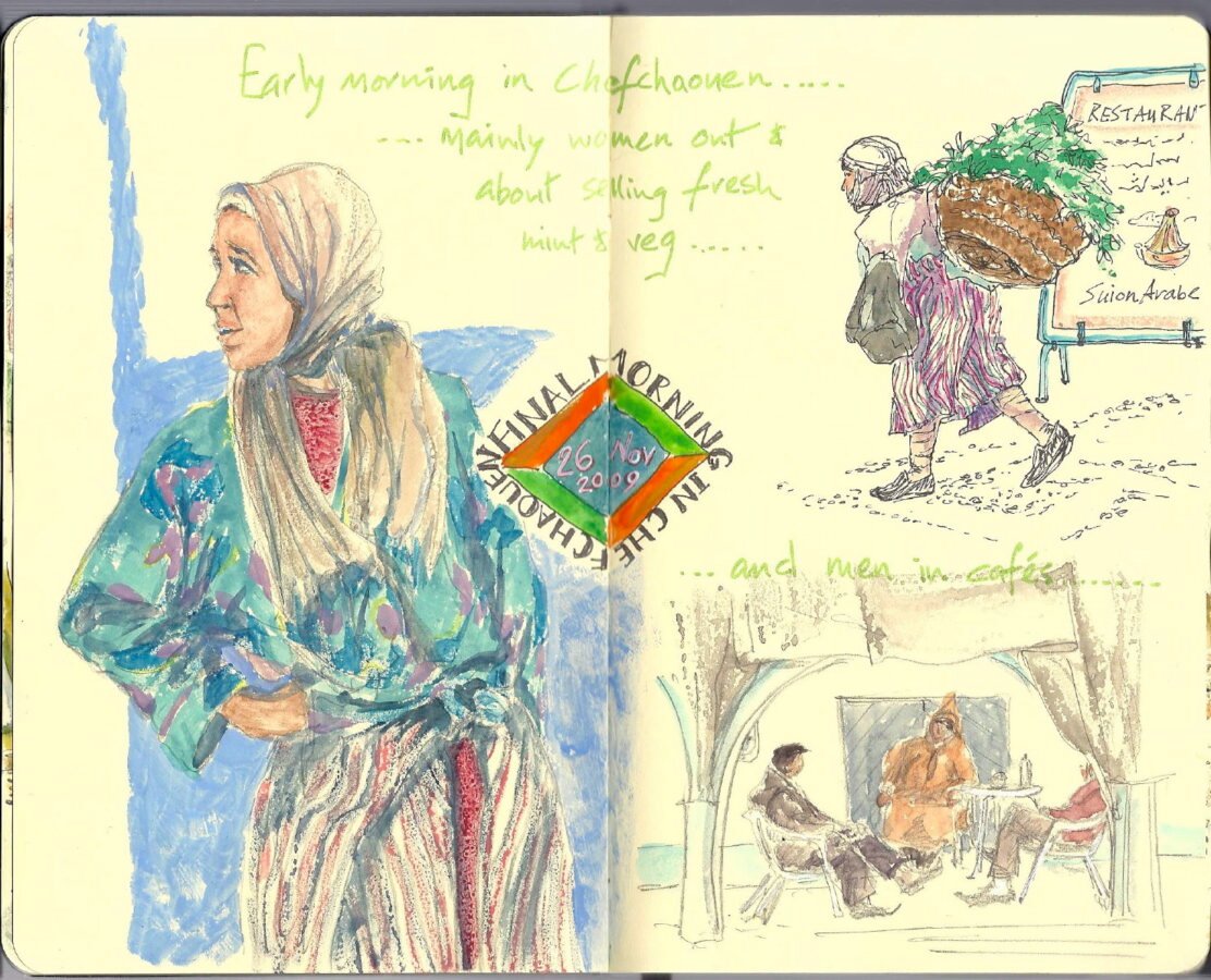
Middle East: Warm Earth and Architectural Geometry
Desert Tones and Sun-Baked Neutrals
The Middle East is defined by warm ochres, sandy beiges, terracotta, and deep browns. These tones reflect desert landscapes, ancient stone structures, and traditional architecture.
Blue Accents and Intricate Patterns
From tiled mosques to coastal towns, you’ll find rich blues, turquoise, and teal woven into the region’s visual identity. These colors create striking contrast against the warm earth tones.
Night Markets and Lantern Light
Deep purples, golds, and warm reds appear in textiles, lanterns, and evening scenes—perfect for atmospheric sketches.
Africa: Bold Contrast and Natural Vibrancy
North Africa: Desert Meets Sea
Expect warm neutrals, indigo, emerald, and terracotta. Markets, ceramics, and coastal towns create a palette that feels both earthy and bright.
West & Central Africa: Pattern, Rhythm, and Color
Bold yellows, deep reds, bright blues, and patterned textiles define the region’s visual energy. These palettes are expressive, rhythmic, and full of movement.
East Africa: Savannah Golds and Ocean Blues
Golden grasses, volcanic landscapes, and turquoise coastlines create a palette that blends warmth with cool, refreshing tones.
Oceania: Coastal Light and Natural Harmony
Australia: Earth Reds and Coastal Blues
The Outback offers deep rusts, warm browns, and muted purples, while the coastline brings in aqua, sand, and bright sky blues. The contrast between desert and ocean creates a dynamic palette.
New Zealand: Greens, Grays, and Alpine Blues
Lush forests, volcanic rock, and glacial lakes shape a palette of emerald, slate, and icy blue. The light is crisp, making colors appear clean and vibrant.
Pacific Islands: Tropical Brights and Lagoon Tones
Expect turquoise, coral pink, palm green, and warm sunset hues. These colors reflect island life, coral reefs, and traditional crafts.
The Americas: From Arctic Cool to Tropical Heat
North America: Diverse and Expansive
- Pacific Northwest: moss green, charcoal, misty blue
- Southwest: adobe red, turquoise, sage green
- New England: autumn golds, cranberry reds, deep forest greens
Central America & the Caribbean: Tropical and Festive
Bright yellows, ocean blues, coral reds, and lush greens dominate. These palettes feel joyful, energetic, and full of life.
South America: Andes to Amazon
- Andean regions: earthy browns, deep blues
- Amazon: rich greens, river blues
- Patagonia: icy grays, muted blues
How to Build Your Own Regional Color Palette
Observe the Light
Light temperature changes everything. Warm climates create golden tones; cooler regions lean toward blue and gray.
Look for Repeating Colors
Notice what appears again and again—rooftops, textiles, landscapes, signage, shadows.
Create On‑Location Swatches
A quick page of color swatches captures the essence of a place better than a photograph.
Use Local Materials as Inspiration
Ceramics, fabrics, spices, plants, and architecture all offer clues to a region’s palette.
Keep It Simple
A palette of 5–7 colors is often enough to evoke a region with clarity and emotion.
Frequently Asked Questions
How do I choose a color palette for a specific region?
Observe the landscape, architecture, and light, then build a palette around the most dominant tones.
Can I mix colors from different regions?
Yes, blending palettes can create unique artistic styles, but staying regional helps maintain a sense of place.
Do I need special paints for travel palettes?
Not necessarily—most travel watercolor sets can be adapted to regional palettes with thoughtful mixing.
How do I capture the atmosphere of a place through color?
Focus on light temperature, shadow color, and the materials that define the environment.
Should I create a new palette for every country?
You can, but many regions share visual themes; a single palette can often cover multiple destinations.
What’s the easiest way to build a palette on the go?
Create quick color swatches in your sketchbook using the colors you see around you.
Can digital artists use regional palettes too?
Absolutely—digital tools make it easy to sample colors and build custom palettes.
How many colors should a regional palette include?
Five to seven colors usually provide enough range while keeping the palette cohesive.

 artistEarth | GEAR & SETUPS
Creative Camera Use for Creating Art Later
Travel has a way of sharpening the senses. Light shifts across a plaza, a coastline curves into the horizon, a market erupts in color — and before you can reach for your sketchbook, the moment...
Final Thoughts
Color Palettes Inspired by World Regions is more than a study of hues—it’s a way of seeing the world. Each region carries its own emotional and visual language, shaped by history, climate, culture, and landscape. When you draw from these palettes, your artwork becomes richer, more grounded, and more connected to place. Whether you’re sketching on location or painting from memory, regional color palettes help you tell deeper, more meaningful stories through your art.
Ready to Share Your Work?
Every travel sketch on artistEarth.com comes from the Sketchbooks.org community. Share your work to be discovered here, and / or join us as a Travel Editor.